Beamax Tested Colored Links And Banner For Increased Click-Throughs
About Beamax
Beamax, a Netherlands-based company, manufactures and distributes projection screens for home cinemas and meeting rooms world-wide. Beamax Screens has upgraded from an all range supplier of projection screens, being a one stop shop, now offering a range of projection screens meeting latest requirements for the Pro-AV and Home-AV market.
Goals
The Beamax team wanted visitors on the home page to go to a site dedicated to ex-demo and one-off items that are sold directly to consumers. (All other screens are sold indirectly through resellers). They wanted to clear up some space in the warehouse that was taken up by uncommon items.
Tests run
Just above the product images on the home page, they put a standard link promoting the other website. It said:
Great deals on brand new and ex-demo screens here
To increase click-throughs to the link, they tested a red link (with the same text), because they felt it would outperform the standard blue that they used. Plus, it’s something direct marketers use in “real” mail pieces too.
As another variation, they transformed the link into something banner-like that they thought would even have more impact. Their hypothesis was that the banner version the sure-fire winner. See the screenshots below:
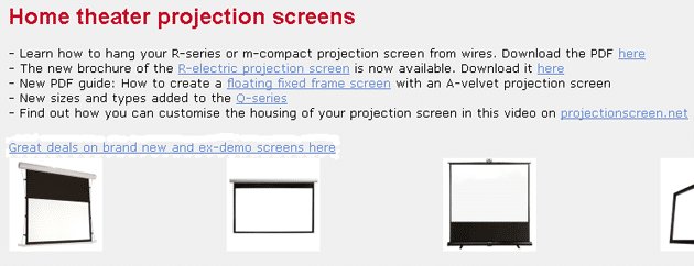
Original Page - Control
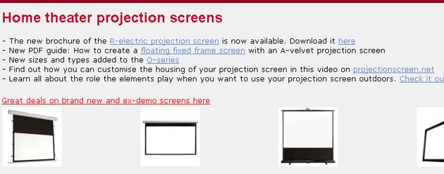
Variation 1 - Page with the Red Link
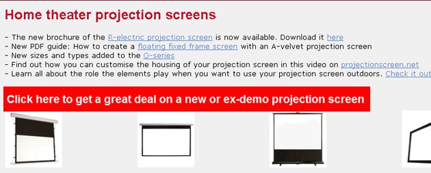
Variation 2 - Page with the Red Banner
So, any guesses on which version got maximum clicks: the blue, red, or banner version? The red link and banner both outperformed the blue link and that wasn’t a surprise. But the eye-opening result was the red link winning from the banner.
The improvement of red link compared to the original blue link was quite significant: 53.13%.
Conclusion
Otto Tromm, CEO of Beamax, stresses the importance of waiting for statistically significant results. He said:
“In the early stage of the test, the banner was the big winner. But, over time (when the results got more reliable), the red link outperformed the banner. That taught me not to jump to conclusions.
And it was tempting to declare an early winner, because initial results proved my gut feeling. The test proved me wrong, so it teaches you to stay humble too.
So would I implement a red link vs a banner blindly next time? No, I would test it!“
Choice of the right tool is certainly important when are you are doing A/B tests. Beamax chose VWO for the test (just like thousands of other businesses).
VWO made it easy for a non-tech guy to do the tests and keep our designer and programmer focused on their own projects. With Google’s solution, it was a lot more work to implement tests, which is why I stopped using it. Just couldn’t get it all done myself, which is important when you have an idea and quickly want it implemented.

Otto Tromm
CEO

Location
Netherlands
Industry
Software
Impact
53.13% increase in Click-through rate