Kaya Increased Website Conversions Using A/B Testing
About Kaya Skin Clinic
Kaya Skin Clinic is a dermatologist-backed chain of beauty clinics that specializes in skin and hair related solutions. Each person has unique skin and hair and therefore the solution provided is highly customized.
Ultraviolet Digital, Kaya’s digital marketing agency observed that conversion rates from Kaya’s website were lower than the category average. They used VWO tools to perform A/B tests to validate improvement opportunities.
Goals: Increase conversion (appointments booked) and walk-ins from the website
Kaya’s website was an important channel for prospects and customers to book appointments and attract walk-ins. Ultraviolet Digital realized that the landing page had not been adequately tested, and that there were various elements that could be improved. Gautam from the agency decided to run multiple tests to figure out what changes would help increase the effectiveness of Kaya’s landing page in driving conversions. He chose the VWO platform to run multiple tests.
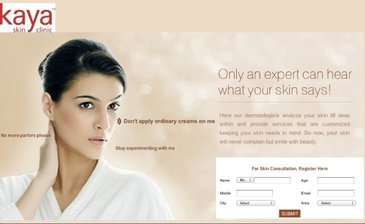
This is what the original landing page looked like:
Control
Tests run: An effectively optimized landing page is vital to create a good first impression that is a precursor to clickthroughs and conversion
Gautam and his team decided to test two hypotheses:
- Rewording the Call To Action text just above the form would increase conversion rates and consequently, sales.
- Social media integration would increase the form submit rate.
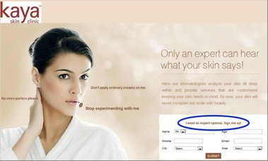
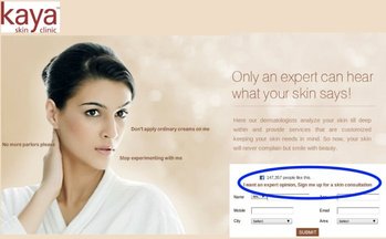
They created two variations and tested them against the control (original landing page) over a period of 45 days. The screenshots of the two variations are shown below.
Variation 1
Variation 2
Conclusion: 137.5% increase in conversion leading to 22% increase in sales with no incremental advertising
Both hypotheses were validated by the test results. Rewording the CTA text just above the form led to massive conversion increases that had a direct impact on the business bottom line. Specifically:
- Conversion rate of Variation 1 was 137.5% better than Control (9.5% versus 4%)
- The CTA text change led to a 22% increase in sales without a single additional dollar spent on advertising.
- Adding social integration (FB likes) further increased the conversion rate by 70%.
So what do these gratifying test results prove?
The first learning that is reinforced is that how the CTA is worded makes a difference. Phrasing it in a manner that clearly showcases the value of the service or benefit of the product to the user is vital. In this case, the phrase “Expert opinion” conveyed the value provided by Kaya’s experts more effectively than the generic “Skin consultation”. With VWO, you can easily test which CTA works best for you. Take a free trial to see how!
The second learning reinforced is the importance of “social proof” as a source of influence. Indeed this is one of the six keys that Dr. Robert Cialdini has written about. In this case, displaying the number of people who “Like” Kaya’s Facebook page is perceived by visitors as an indicator of social proof and this helps build trust towards Kaya in them.

Location
Mumbai, India
Industry
Health
Impact
137.5% increase in Conversion