How To Do A/B Split Testing on Low Traffic Sites
What does ‘low traffic’ really mean? How much traffic does it refer to?
On a rough basis — if your website gets less than 5-10 conversions per week, you have a low traffic website, says famous conversion expert Bryan Eisenberg in this video.
He also adds that you should run a test for a maximum of six weeks and if that doesn’t show you much difference in results, you’re probably not testing something that’s influencing visitors’ behavior.
Download Free: A/B Testing Guide
Another conversion expert, Rich Page, mentions that a site getting 1,000 unique visitors per week or less is a low-traffic website.
The problem with small traffic sites is that running split tests on them seems futile.
Let’s say, you have an existing conversion rate of 5%, and the expected percentage increase in conversions is 10%. If you’re testing 4 variations, you might have to wait for months or even years to get conclusive results (95% confidence level), depending on your website traffic. You can use this free duration calculator to validate this point.
Who would wait for so long? It doesn’t make any sense.
I feel you. Your argument is right. It isn’t that easy.
But to think that there’s no way out of this situation is wrong. And this is exactly what this article aims to explain — that small-traffic sites can also split tests to optimize their conversion rates. Here’s how:
1. Track Micro-Conversions, Instead of Macro-Conversions
Product sale or paid signups are the ultimate goals, yes. But these macro-conversions are relatively harder to come by.
When you have a traffic crunch, instead of tracking test data by macro-conversions, declare test results with micro-conversions that indirectly contribute to sales. As long as you know the conversion ratio from micro-conversions to the ultimate goal, you can calculate the effect on macro-conversion and know which test version is working for you.
2. Test Something High-Impact
Maybe you want to test a new pricing plan? Or replace that image slider with a great discount offer to your most popular product category? Make sure all the prominent website estate—such as the site’s header, above-the-fold area, and left-side of the page—is occupied by important page elements that eventually contribute to your page goal. Think about something that can give you a new insight and take you in a new direction for future tests.
Sometimes small changes have a big impact on conversion rates. The key for such results is testing something that has a high impact on the customers’ psyche. Something that can influence their decision.
Understand their concerns. Know what primary factors they consider before taking an action on your site. For a funky clothing site that targets teenage and college students, pricing and free shipping can be very important. For a luxury-clothing brand that focuses on high-end celebrities, 1-day shipping guarantee or exclusive collection section on the site might be high-impact.
Know what matters the most to your ideal customer. When you test something high-impact, the drastic difference in results reduces the time taken to declare statistically significant results.
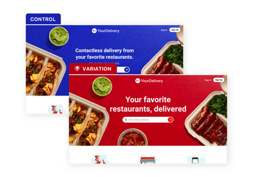
3. Test Radical Designs
When you ask your customers to choose between a red apple and a green apple, it will be difficult to say what the majority will prefer. You will need a huge sample size to answer that. Ask them for a choice between apple or orange — and even a small sample size of the audience will soon tell you what most people prefer.
The table below from TechCrunch portrays this perfectly. Drastic changes often impact the conversion rate in a big way as well. Notice that as the difference between the previous and the new conversion rate increases, the requirement for test visitors and test duration to run the test decreases:
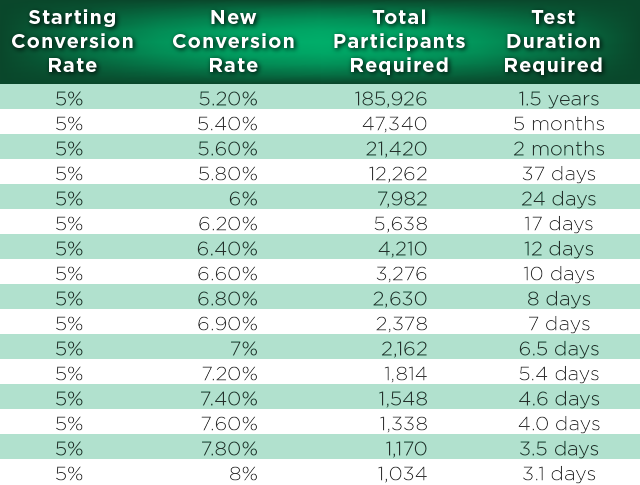
Thus, you must do away with button color tests and the likes if you have little traffic. Drastic changes make you reach conclusive results quickly.
But the drawback to these tests is that it is difficult to get any learnings from them. You cannot know what change increased or decreased the conversions. Was it shifting the call-to-action below the fold that worked? Or is it the change in the headline? Or anything else?
One great way to overcome this drawback is testing two different themes in these page-level tests rather than randomly changing multiple page elements. Getting significant customer learnings from such tests is easy and can be very useful for future tests.
Know that you’ve hit the jackpot when you get a learning that you can apply to optimize your overall marketing efforts, including your offline campaigns. When a rehabilitation facility chain tested their control page that focused on luxurious features and secluded location of their centers against the trust-focused approach on their challenger page, they got a 220% lift.
Now they knew that trust is a big concern for their customers. When this learning was applied across 300 other websites that they own, their paid search revenue increased by 85%.
This way even when you’re changing multiple elements, you will still understand more about customer motivations which will further help you in your CRO efforts. Test your page themes when testing a radical design. You will get results sooner and will also understand your customers better.
But to bring drastic design changes, you need a solid experimentation program. Watch the webinar to learn how to build one from scratch.
4. Forget Multivariate Testing (MVT)
The more variables you change, the longer it will take to achieve statistical confidence. Limited traffic means you don’t have enough resources for multiple test variations. Stick to A/B split tests until you have sufficient traffic.

Traffic split between multiple variations in MVT
5. Run Site-Wide Tests
Site-wide tests give you the benefit of cumulative traffic and take only a few minutes to implement. If you are a VWO customer, you can simply use this URL pattern to run a site-wide test: “https:www.yoursitename.com/categoryname/*”
But for this to work, the URL patterns of your site must be sorted. The asterisk (*) above denotes that the test will be run on all pages of the given category.
Download Free: A/B Testing Guide
6. Try Sequential Testing
Run one version first. Then the next version for the same time period. Compare the results in your Google Analytics from the two versions. Since you will be sending double the traffic to each website version, you will have more data than you’d have had if you followed the traditional split testing way.
This is not as scientific or accurate as split testing. But this can still work if the user motivation remains the same in both cases. Be careful about external factors that might skew the results such as the holiday season, any economic event, and so on.
Run tests on exactly the same days of the week. If the first version was tested from Monday to Saturday, do the same for the next version too. Make sure that there is no change in traffic sources, social media campaigns or any PR activity during this time.
The more closely identical your environments are (while testing both the versions), the more accurate your results will be. Of course, results of sequential testing can many times be misleading because of the validity threat it faces due to the history effect — that is the effect of an extraneous factor on a test variable as time passes. Still, it is better than not testing at all.
7. Run Qualitative Tests
Make a genuine move to improve your website by knowing your customers. You can go about this in many ways:
Usability Testing: Seeing how users interact with your website, the unique website path they follow, time taken by them to complete the conversion goal, where they get stuck or frustrated is revealed all too clearly by this method.
Traffic has nothing to do with this. Watching a few individual sessions will give you so many good ideas about improving visitor experience on the site. Read this article to know how you should do usability testing to get accurate insights. For remote usability testing of your website, you can use usertesting.com.
Conduct Customer Surveys: You can either mail a small questionnaire to your current customers, or you can conduct on-site surveys. A SaaS company might ask customers on their pricing page if their pricing is clear, an eCommerce company might e-mail their customers asking if they have praised or criticized their site to a friend in the past few months and what it was about?
The insights you get from customer surveys are fascinating. Just be sure that you do not annoy them by sending surveys too often. For on-site surveys, stick to 1-2 questions per session. See how Kellogg Business School implements this on their website:

Analyze Heatmaps: Even with small traffic, heatmaps can give a pretty good idea about visitors’ interest. If there is any obscure element that is attracting more attention than it should, if a call-to-action or an important navigation element is getting ignored, until where are people scrolling on a page, you can see it all.
Fixing any flaws in placement of elements, visual hierarchy and other such concerns become a lot easier with heatmaps. Want to generate a heatmap for your web page? Signup for the free trial of our A/B testing software with built-in heatmaps.
Improve Site Load Time: Whatever your traffic volume might be, every one second of delay in the page load time reduces conversions by 7%.

According to another statistic shared by KISSmetricsp, 40% of visitors abandon a website that takes longer than three seconds to load. And you might already know, page load time is a ranking factor too. Do yourself a favor and fix this money leak by following these tips.
Drive Some Targeted Traffic to Your Site for Testing
Before you start a test, I’d recommend that you calculate the number of days for which you will need to run the test. You can use this calculator for a quick workaround. If the duration seems too long, consider running a campaign or two to push some paid traffic. Or take advantage of your subscriber list to divert e-mail traffic.
Facebook, Adwords and getting the word out about your site/product on popular industry blogs are some quick ways to increase the traffic inflow on your website for testing. But if you decide to go this route, don’t forget to segment your result data on the basis of traffic sources to see which traffic converted the best for you.