
What is Multivariate Testing? When And How You Should Use It
Multivariate testing (MVT) is a form of experimentation wherein multiple elements of a webpage are modified and tested to determine which combination of the page leads to the maximum positive impact on conversion. Just as traffic is split between the two variations in A/B testing, in multivariate testing, the traffic is split between all the variations. Multivariate testing is especially useful when you want to test the impact of radical changes on a webpage as opposed to testing the impact of one specific element.
Download Free: Multivariate Testing Guide

Multivariate testing is not only restricted to testing on webpages but is used in a range of marketing fields. One of the simplest types of multivariate testing is run on PPC ads. For example, a standard Google Ad that appears in your search has two elements you can test; the headline and the copy.

Say you made two versions of the headline and two versions of the body copy. A multivariate test for such an ad would have 4 variations:
| Variation 1 | Headline 1 | Copy 1 |
| Variation 2 | Headline 1 | Copy 2 |
| Variation 3 | Headline 2 | Copy 1 |
| Variation 4 | Headline 2 | Copy 2 |
Multivariate testing with PPC ads is relatively easy as you are just modifying the headline and copy. There are a limited number of variables.
On a webpage, there are a lot more elements you can test. This makes it incredibly important for you to craft your hypothesis carefully. The larger the number of elements to be tested, the more would be the number of variations.
The important thing to note here is that more the number of variations your test has, the larger would be the required sample size to run it successfully. This means you either need more visitors, or the test will take longer to reach statistical significance as compared to a simple A/B test.
Clearing the confusion – multivariate vs. A/B testing
The world of testing can be confusing, and you might often find yourself conflicted with regards to choosing the right approach for your business and its unique requirements. Let’s understand the key differences between A/B testing and multivariate testing so you can confidently decide when to use which one.
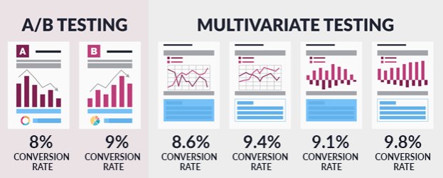
In an A/B test, versions of a single element are created to deduce which one drives a higher positive impact on conversion rate. For instance, if you decide to run a test on the CTA text of your product page, it qualifies as an A/B test. Each of your variations will have a modification of the CTA text.
However, if you decide to run a test on the headline, image, and form of your landing page together, each of your variations would comprise a variant of each of these three elements. Therefore, this will help you conclude which combination of these three elements has the highest positive impact on your key metrics.
While A/B testing is pretty much a question of either/or, multivariate testing can get quite complex when it comes to zeroing in on the best version of a particular page.
Another key difference between the two is that the variations tend to be strikingly dissimilar in an A/B test, which is not so much the case in a multivariate test. Since there are so many variations, in MVT, you might not notice many stark differences between some of these. The overall look and feel of each variation is far more visibly contrasting in A/B testing as it focuses on one big change rather than multiple small changes.
Time and traffic requirements are also quite different when running A/B and multivariate tests. Since A/B tests have fewer variations, you will need far less traffic to reach statistical significance as compared to running multivariate tests. This also means that an A/B test can be wrapped up way sooner as there are only two options, while an MVT would undoubtedly take longer given its high traffic requirement and higher number of variables.
Why should you go for multivariate testing?
Multivariate testing allows you to drill down and see exactly which combination of your critical website elements yields the best results. The changes in a multivariate test are more subtle than those in an A/B test, but give you an insight into how key elements can work together to drive significant improvement in your conversion rates. Multivariate testing, therefore, is best deployed when you wish to optimize landing pages, your homepage, or any other critical page without having to go for a complete redesign.
Another crucial benefit of multivariate testing is that it saves you time as you test multiple variables simultaneously as opposed to testing them iteratively and measuring the impact of each. You also get to measure how each of the variables interacts with one another and impact your overall goal.
In this regard, multivariate testing is an efficient method for quickly testing a range of variables. Case in point is the following success story from Hyundai.nl.
Hyundai Netherlands had a simple goal of improving the conversion rate of their car landing pages. These pages were critical as people could request test drives or download brochures here. Since they had multiple ideas to optimize these landing pages, they decided to opt for multivariate testing, wherein they tested the following:
- SEO friendly copy vs. original copy
- An additional CTA vs. a single CTA
- Large photos of the cars vs. thumbnails
Here’s a look at the control and variation from the test:
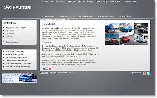

The results of the test were extremely impressive. The winning version of the page generated a 62% uplift in conversion rate and a 208% increase in click-through rates.
Running this as an A/B test would have wasted a significant amount of time, which equates to lost revenue for a large company like Hyundai. Multivariate testing not only allowed the test to be run in a shorter time period, but also generated valuable results.
Download Free: Multivariate Testing Guide
How to get started with multivariate testing
Any form of experimentation requires dedicated effort and a coherent approach. The steps to run an MVT are similar to those for running an A/B test. Below is a framework you can use for getting started with multivariate testing:
- Identify a visitor pain point based on quantitative and qualitative insights gathered
- Formulate a solid hypothesis to solve for it
- Create variations for the MVT
- Determine your sample size and configure your visitor segments
- Define your conversion goals
- Set up the test and start driving traffic to your control and variations
- Run the test until statistical significance is reached
- Analyze your test results report
- Draw insights and learnings from your test
Use your website data to identify the problem area, and then pinpoint the elements you want to test on the particular page to solve for it. Go ahead and formulate a strong hypothesis that tackles all these elements based on your understanding of your target audience and the available data.
Once you have designed all your variations, you are all set to configure your visitor segments and define your conversion goals for which you wish to measure the impact of your variations. Finally, go ahead and create your MVT and be sure to run it until statistical significance is reached. Use VWO to easily set up your MVT using a Visual Editor and without writing a single line of code. Sign up for a free trial to assess it for yourself.
Finally, analyze your test results to determine the winner so you can deploy the winning variation universally. Also use the insights drawn from the test to learn more about your target audience and streamline your optimization pipeline accordingly.
This is the approach Microsoft Office took when they sought to optimize their conversion rate by testing multiple versions of their landing page.
The agency that undertook the project decided to test the hero shot, title, description, call to action, and the resource links on their landing page. Here’s what the control looked like:

Image source: Slideshare
They then ran a multivariate test. After testing a combination of elements, the one below stood out to be the clear winner. The test results revealed a 40% increase in conversions from this design over the original.
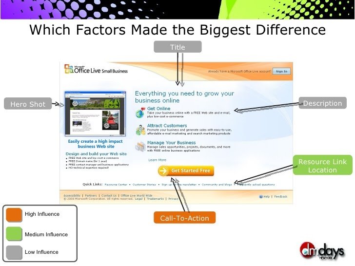
What is interesting about this multivariate test is that it also helped the teams analyze the relative importance of the various elements of the page. Rather logically, the call to action stood out to the most important one and had the maximum influence on their conversion rate.
The test results of this case study are a testament to just how effective multivariate testing can be in not only increasing conversion rates, but also providing valuable insights on how various elements of a page interact with each other and which one is relatively more important for you.
Multivariate testing – a vital tool in boosting conversion rates
As this guide has illustrated, multivariate tests can be an extremely useful tool in helping you test radically on your critical pages to drive dramatic improvements to your key metrics and thus your top line.
So, if you are looking to optimize the landing page for your next big marketing campaign to make it a lead magnet, you can rely on multivariate testing to tell you which version of the page you must go ahead with. It’s time to get started and put the theory to test on your site!
Categories: