How Trinity Insight Aided Taylor Gifts Boost CTR On The Add-to-Cart CTA
About Trinity
Many eCommerce retailers start A/B testing variations of that button to improve the click-through rate. That’s precisely what Trinity Insight, a VWO customer, did for their client Taylor Gifts.
Trinity Insight is an award-winning agency that has helped numerous clients increase their website conversion rate. They are also one of our certified agencies.
Goals
The main objective was to increase click-throughs on the “Add-to-Cart” button on their product page.
Tests run
The test was run on the dynamic product page. They used VWO’s advanced mode to create a test that runs across thousands of dynamic product pages on Taylor Gifts.
Here’s what the original product page looked like:
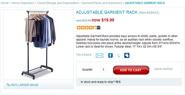
Original Product Page
We ran an A/B split test; however, we focused mainly on creating a buy box with all of the information relevant to the buying decision located in proximity to the Add to Cart action.
The hypothesis was that presenting information clearly in the variation would help people find the information they needed to make a decision faster and at a more convenient location, therefore, making them more likely to place the item in their cart.
Here’s the variation tested:
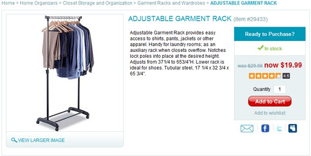
Variation Product Page (10% increase in click-throughs)
Conclusion
The variation experienced a 10% lift in the goal conversion on this page and the overall eCommerce conversion rate of the test subjects went up from 1.53% on the control to 3.23% on the variation. Needless to say, Taylor Gifts were very happy with the result!
Lessons from the Test
- Placing the standard information we all use to make buying decisions in one easy to scan location makes a lot of sense from a sales standpoint. In traditional retail, ideally, a salesperson would be in close proximity of the item to answer questions about how much it is, and if it’s on sale how much you’re saving. They’d also let you know what other customers thought as so often we use our peers to help us make our decisions.
- Providing valuable eCommerce information near this box may also be a good idea as in how long will it take to get to me and what do I do if I have to return it. More detailed information is great on the page for people looking to make in depth research-based purchases, but the segment of customers who prefer to move quickly through this process will find lots of value in an efficient buy box strategy.
Role of VWO
VWO was irreplaceable in this test as we’ve done dynamic template tests like this in the past with Google WO and spent an inordinate amount of time creating a custom javaScript and would then need to work with the clients IT team to implement on their site whereas we were able to accomplish the same test with VWO all from within the administration area. Testing with VWO is easy. Explore the features of this connected platform with a 30 day all-inclusive free trial.

Location
Philadelphia, PA (US)
Industry
Agency
Impact
10% increase in Click-through rate