
In today’s rapidly evolving digital landscape, where brands and businesses compete for the attention of…
Niti Sharma
9 Min Read
Your conversion rate optimization (CRO) strategy fundamentally runs on two wheels—Search engine optimization (SEO) and…
Nida Zehra
10 Min Read
VWO, the experimentation platform used by fast-growing brands the world over, recently announced a partnership…
Niti Sharma
3 Min Read
A deep dive into how VWO’s advanced targeting capabilities, robust integration ecosystem, and sophisticated experimentation…
Niti Sharma
8 Min Read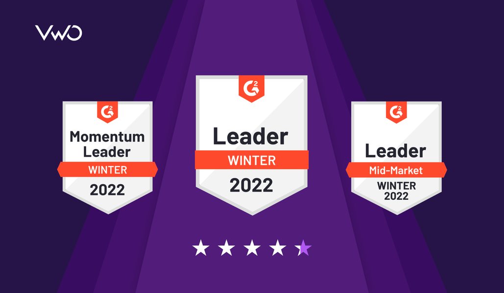
VWO has been recently recognized as a leader in the A/B testing category by G2—a…
Nida Zehra
4 Min Read
A/B testing goes hand-in-hand with every marketer’s CRO strategy. Being a marketer or a CRO…
Nida Zehra
7 Min Read
The search for better conversion is often attributed to the marketing approach. However, it is…
Marc Wabnitz
8 Min Read
You’re an eCommerce brand manager ready to learn more about your customers and how they…
Natalie Thomas
12 Min Read
User experience (UX) is a gauge of how people feel when they interact and engage…
Kevin Payne
13 Min Read
Join our community of 10,000+ Marketing, Product & UX Folks today & never miss the latest from the world of experience optimization.
Talk to a sales representative
Free for 30 days. No credit card required
Awesome! Your meeting is confirmed for at
Thank you, for sharing your details.
I can't wait to meet you on at

, thank you for sharing the details. Your dedicated VWO representative, will be in touch shortly to set up a time for this demo.
We're satisfied and glad we picked VWO. We're getting the ROI from our experiments.
Christoffer Kjellberg CRO Manager
VWO has been so helpful in our optimization efforts. Testing opportunities are endless and it has allowed us to easily identify, set up, and run multiple tests at a time.
Elizabeth Levitan Digital Optimization Specialist
As the project manager for our experimentation process, I love how the functionality of VWO allows us to get up and going quickly but also gives us the flexibility to be more complex with our testing.
Tara Rowe Marketing Technology Manager
You don't need a website development background to make VWO work for you. The VWO support team is amazing
Elizabeth Romanski Consumer Marketing & Analytics Manager


Awesome! Your meeting is confirmed for at
Thank you, for sharing your details.


