AquaSoft Increased Purchases Using VWO Split Testing
About AquaSoft
AquaSoft was founded in 1999 in Germany, and is a pioneer in photo presentation software. Their products cover a wide range, including SlideShow creation, desktop publishing, photo books, and so on.
They used VWO for testing changes on their website.
Goals
The goal was to increase the purchases on the product overview page. This page already had a higher conversion rate than the rest of the pages, because people who visit this page already are interested in buying.
Tests run
The test was run on the Shop Overview (listing of all articles) page.
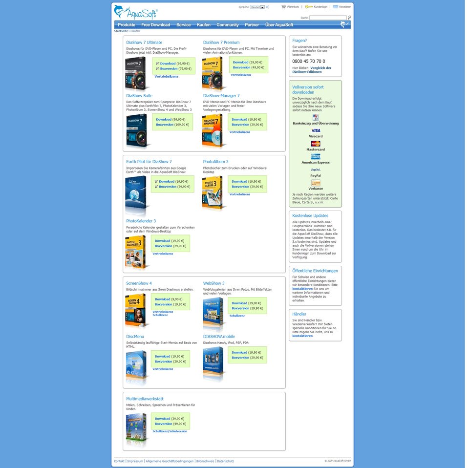
Original Version
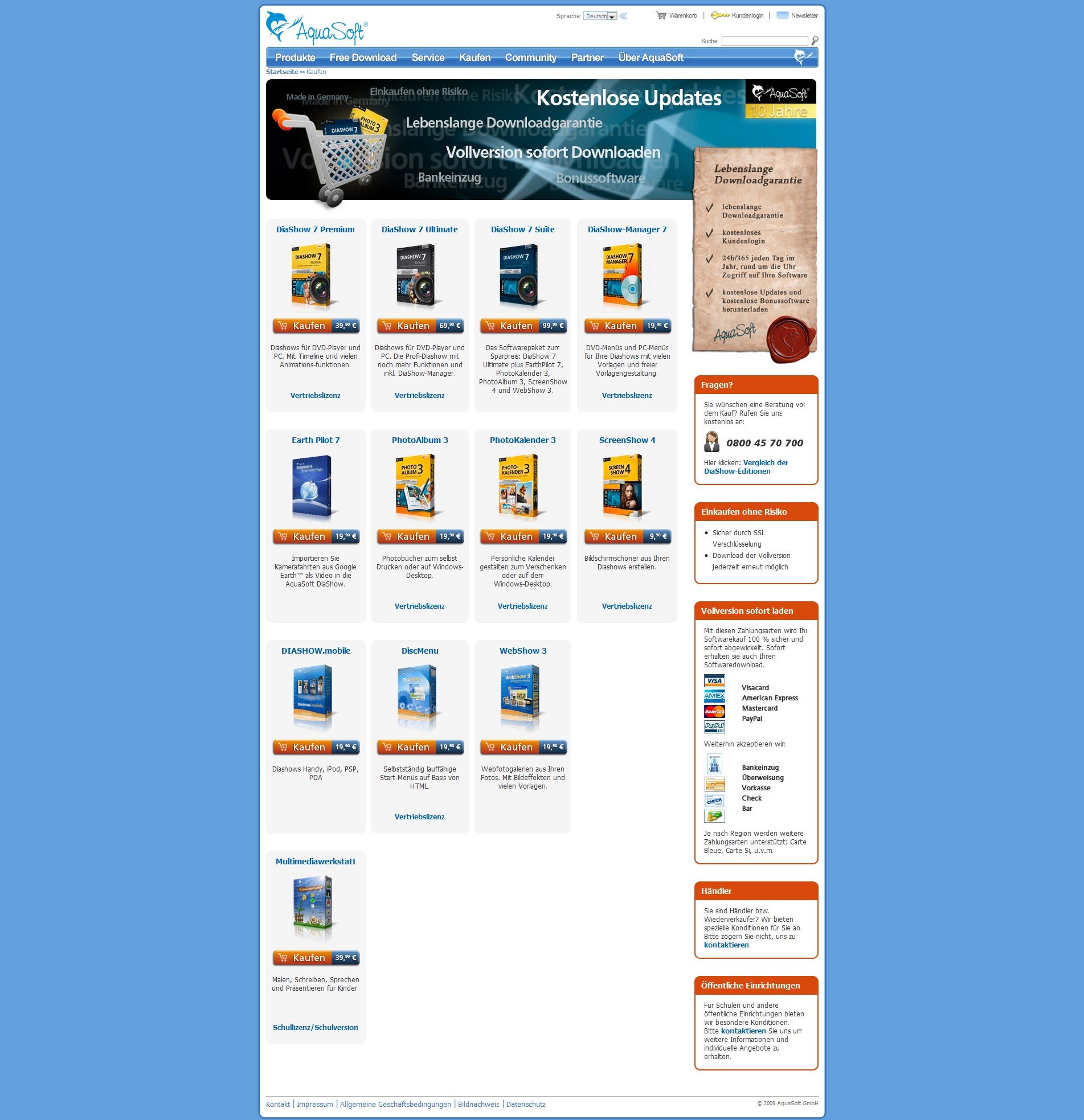
The variations that were created had:
- Clearer design
- Trust-building wording describing the shopping process
- An explicit guarantee that people can download and use the software for life
Conclusion
The purchases showed an increase of 17.7%.
The number of clicks into the shopping cart from Google Analytics and VWO were about the same. It showed that the bounce rate within the shopping cart was somewhat higher in the winning combination, but the overall increased click rate outtakes the bounce rate.
In the second phase, some whitespace was removed and the product name was moved above the box shots, which led to another 10% increase in clicks and the final increase in purchases settled at about 20%.
Takeaways
The concrete test showed that a clear modern design improved sales. Trust building is important, especially in the sales process.
Also, AquaSoft found VWO to be quite valuable:
It was so incredibly easy to create the test (A/B split test in this case) that it takes nearly no time. Because we use an external shopping cart, we can not measure in the cart itself so the feature of VWO tracking a click on a link without loading the page made it possible to run the test at all.

Location
Potsdam, Brandenberg (Germany)
Industry
Software
Experiment goals
Increase in number of purchases
Impact
20% increase in Purchases