Continuous A/B Testing Helped WriteWork Boost Number of Purchases
About ClickLab
ClickLab is a Brazilian agency specializing in Conversion Rate Optimization, and they used VWO to test a radical redesign of the primary page on WriteWork.com, a popular essay website for students.
Goals
The traffic was nearly exclusively organic, and the page was struggling with high bounce rates for a while. The objective was to increase engagement and get more people further down the funnel (which ultimately led to an increase in purchases).
Observations
A key challenge was how to go about testing the new design. Everything about it was different, from the header to the footer. This meant a user might land on the home page, which has one look, then click on to the redesigned page, which has a different look.
Tests run
Luckily, the above challenge was easily solved by using VWO. As the primary objective was to increase engagement on the landing page, the following segmentation trick was used:
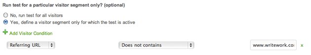
By restricting the test to only the visitors landing on the page, engagement could be measured without having to worry about the design not being consistent throughout the site.
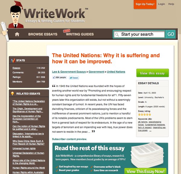
The original page didn’t communicate what the benefits of the service are. Following is how the original design, or control, looked like:
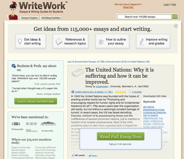
After reviewing over 1,000 survey responses, it became clear what the real benefits were and then these benefits were communicated much more directly in the variation. Next, social proof and various credibility indicators were introduced.
Here is how the variation looked like:
A/B Test Results
The result of the test was that the engagement more than doubled. One important thing to note is that engagement in VWO measures only clicks and not submissions of forms, for example, using a search form (for this reason, searches were measured separately).
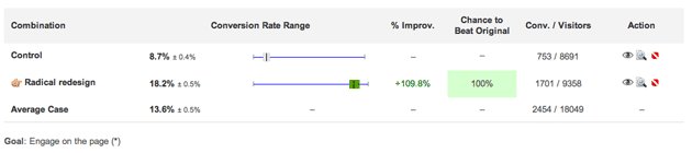
The great thing about VWO is that you can measure multiple goals. This meant that it’s possible to see exactly where the engagement was happening – the biggest increase was indeed the clicks on the CTA. The 4 top buttons accounted for less 1% in engagement increase.
The secondary objective was to get users to click the primary CTA; and here, results increased by 144%.
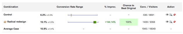
This meant that more than twice as many people continued on to the payment page. More payment page views don’t automatically mean more purchases, but a follow-up test showed that purchases went up by over 50%.
Conclusion
Although the results were fantastic, they weren’t that surprising. After going over the surveys from users, it became so clear that the original did a terrible job at selling the service.
What allowed them these fantastic results was that they started with the users in mind; doing everything they could to understand him/her—understand their wants, their worries, and their needs.
They also looked closely at the language used on the website. For example, WriteWork has always used the expression “overcome writer’s block,” but no users used these words. Instead, users wanted to hear “get started” and “get inspiration.” So, now they use that language on the website.
Jens Schriver from ClickLab gave VWO a nice, short testimonial:
It was a breeze to set up this A/B test and segment it. We’ve used Google Website Optimizer many times in the past, but – if we can avoid it – we are not going back ?

Jens Schriver
Founder

Location
Brasilia, District Federal (Brazil)
Industry
Agency
Impact
50% increase in Purchases