Learn How Experts Derive Insights from A/B Test Results
You conducted an A/B test—great! But what next?
How would you derive valuable insights from the results of A/B testing? And more importantly, how would you incorporate those insights into subsequent tests?
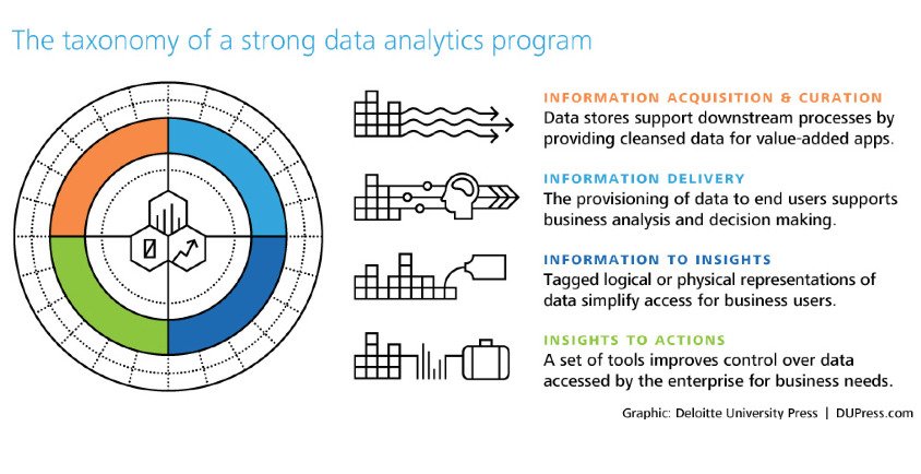
Acquiring information is perhaps the easier part of a data analysis program. Drawing insights from that information and converting those insights into actions is what leads to successful results.
Download Free: A/B Testing Guide
This post talks about why and how you should derive insights from your A/B test results and eventually apply them to your conversion rate optimization (CRO) plan.
Analyzing your A/B test results
No matter how the overall result of your A/B test turned out to be — positive, negative, or inconclusive — it is imperative to delve deeper and gather insights. Not only can this help you to aptly measure the success (or failure) of your A/B test, but can also provide you with validations specific to your users.

As Bryan Clayton, CEO of GreenPal puts it, “It amazes me how many organizations conflate the value of A/B testing. They often fail to understand that the value of testing is to get not just a lift but more of learning.
Sure a 5% to 10% lift in conversion is great; however, you are also trying to find out what makes your customers say ‘yes’ to your offer.
Only with A/B testing can you close the gap between customer logic and company logic and, gradually, over time, match the internal thought process that is going on in your customers’ heads when they are considering your offer on your landing page or within your app.”
Here is what you need to keep in mind while analyzing your A/B test results:
Tracking the right metric(s)
When you are analyzing A/B test results, check if you are looking for the correct metric. If multiple metrics (secondary metrics along with the primary) are involved, you need to analyze all of them individually.
Ideally, you should track both micro and macro conversions.

Brandon Seymour, founder of Beymour Consulting rightly points out: “It’s important to never rely on just one metric or data source. When we focus on only one metric at a time, we miss out on the bigger picture. Most A/B tests are designed to improve conversions. But what about other business impacts such as SEO?
It’s critical to make an inventory of all the metrics that matter to your business, before and after every test that you run. In the case of SEO, it may require you to wait for several months before the impacts surface. The same goes for data sources. Reporting and analytics platforms aren’t accurate 100 percent of the time, so it helps to use different tools to measure the performance and engagement. It’s easier to isolate reporting inaccuracies and anomalies when you can compare results across different platforms.”
Most A/B testing platforms have built-in analytics sections to track all the relevant metrics. Moreover, you can also integrate these testing platforms with the most popular website analytics tools such as Google Analytics. Integrating VWO with a third-party tool is simple and allows you to push your VWO test data into the external tool. It also allows the data made available by these tools on the website to target campaigns.VWO offers seamless integration with popular analytics tools as well as plugins for content management systems which makes it very easy to install the VWO code and start optimizing your website.

Conducting post-test segmentation
You should also perform segmentation of your A/B tests and analyze them separately to get a clearer picture of what is happening. The results you derive from generic nonsegmented testing will provide illusory results that lead to skewed actions.
There are broad types of segmentation that you can create to divide your audience. Here is a set of segmentation approach from Chadwick Martin Bailey:
- Demographic
- Attitudinal
- Geographical
- Preferential
- Behavioral
- Motivational
Post-test segmentation in VWO Testing allows you to deploy variation based on a specific user segment. For instance, if you notice that a particular test affected new and returning users differently (and notably), you will want to apply your variation only to that particular user segment.
However, searching through lots of different types of segments after a test means you are assured of seeing a lot of positive results just because of random chance. To avoid that, make sure you have your goal defined clearly.
Here’s how you can use the various segmentation options provided by VWO to slice and dice your website traffic and understand visitor behavior.
Delving deeper into visitor behavior analysis
You should also monitor visitor behavior analysis tools such as Heatmaps, Scrollmaps, Visitor Recordings and so on to gather further insights into A/B test results. For example, consider a search bar on an eCommerce website. An A/B test on the navigation bar works only if users actually use it. Visitor recordings can reveal if users are finding the navigation bar friendly and engaging. If the bar itself is complex to understand, all the variations of it can also fail to influence users.
Apart from giving insights on specific pages, visitor recordings can also help you understand user behavior across your entire website (or conversion funnel). You can learn how critical the page on which you are testing is in your conversion funnel.

Download Free: A/B Testing Guide
Maintaining a knowledge repository
After analyzing your A/B tests, it is imperative to document the observations from the tests. This helps you not only in transferring knowledge within the organization but also in using them for reference later.
For instance you are developing a hypothesis for your product page, and want to test the product image size. Using a structured repository, you can easily find similar past tests which could help you understand patterns on that location.
To maintain a good knowledge base of your past tests, you need to structure them appropriately. You can organize past tests and the associated learning in a matrix, differentiated by their “funnel stage” (ToFu, M,oFu or BoFu) and “the elements that were tested.” You can add other customized factors as well to enhance the repository.

Look at how Sarah Hodges, co-founder of Intelligent.ly, maintains track of the A/B test results, “At a previous company, I tracked tests in a spreadsheet on a shared drive that anyone across the organization could access. The document included fields for:
- Start and end dates
- Hypotheses
- Success metrics
- Confidence level
- Key takeaways
Each campaign row was also linked to a PDF with a full summary of the test hypotheses, campaign creative, and results. This included a high-level overview, as well as detailed charts, graphs, and findings.
At the time of deployment, I sent out a launch email to key stakeholders with a summary of the campaign hypothesis and test details and attached the PDF. I followed up with a results summary email at the conclusion of each campaign.
Per my experience, concise email summaries were well-received; few users ever took a deep dive into the more comprehensive document.
Earlier, I created PowerPoint decks for each campaign I deployed, but ultimately found that this was time-consuming and impeded the agility of our testing program.”
Applying the learning to your next A/B test
After you have analyzed the tests and documented them according to a predefined theme, make sure that you visit the knowledge repository before conducting any new test.
The results from past tests shed light on user behavior on a website. With a better understanding of the user behavior, your CRO team can have a better idea about building hypotheses. This can help the team create on-page surveys that are contextual to a particular set of site visitors.
Moreover, results from past tests can help your team come up with new hypotheses quickly. The team can identify the areas where the win from a past A/B test can be duplicated. Also, the team can look at failed tests, know the reason for their failure and steer clear of repeating mistakes.
Conclusion
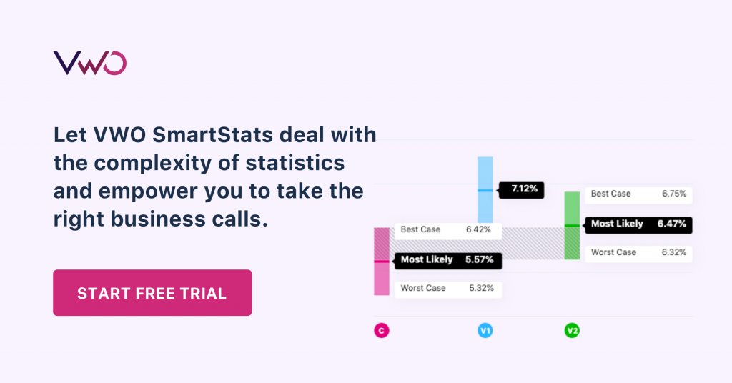
A/B testing is in itself a challenging endeavour. To derive actionable insights from it is a whole different ball game. How do you analyze your A/B test results? Do you base your new test hypothesis on past learning? Data driven decision making has to be at the heart of your experimentation projects. VWO SmartStats frees you from dealing with complexity of statistics and enables you to take quick and intuitive business decisions.


![7 A/B Testing Examples To Bookmark [2024]](https://static.wingify.com/gcp/uploads/sites/3/2019/12/Feature-image_7-AB-Testing-Examples-To-Bookmark-2021.png?tr=h-600)