How To Use Image Carousels the Right Way?
Oh, the annoying merry-go-rounds!
I’ve lost track of the number of times I’ve tried to get hold of those running slides on a website. It’s just so irritating to try and hastily read what has been written before another slide takes over. Now, I don’t even bother to scan any further than the first slide of image carousels.
I thought I’m the only one who couldn’t stand these automatic sliders. But thank god, there are others like me as well!
Download Free: A/B Testing Guide
These rotating slides either get ignored by the user or further confuse them, thereby impacting the overall user experience and conversions on the website.

A usability study by Nielsen Norman group confirmed that auto-forwarding carousels annoy users and reduce visibility.
The study highlights a couple of reasons why these believed-to-be “cool” design element are actually not good for your site’s usability or conversions:
- Automatic rotation makes the user lose control of their interaction with the site. This is especially annoying for users with motor skill disorder or dyspraxia.
- They create banner blindness and are often easily ignored by users. The eye tracking example below from another source also validates this. You can see how the image slider (the black area in the picture) hardly gets any attention by site visitors.
3. Low-literacy users and international users (whose native language differs from the language on your website) often read slowly. A user clearly expresses his frustration in the study when he says, “I didn’t have time to read it. It keeps flashing too quickly.“
Besides, sliders don’t work well on mobile devices. I wonder if these sliders are so confusing and annoying for so many other users, why is it that they are almost everywhere? As it turns out, image carousels or rotating banners are often thought of as an easy solution to provide better navigation to all the important content/offers on the site. The data suggests otherwise though.
Notre Dame University tested their carousel. The chart below shows the results they found. Only 1% of total visitors clicked through from the carousel, and the majority of these visitors (84%) interacted with only the first slide of the carousel.

Okay, I get it! Every department wants to have their special offer on the homepage.
But frankly, 1% clickthrough rate from an element which occupies major homepage real estate is a clear wasted effort. Do you still think image sliders are a good idea?
Apart from posing a usability challenge, carousels stuff multiple offers in one place, which is a big conversion killer. Like the proven conversion wisdom suggests, you should ideally have only one offer or call-to-action per page. And carousels definitely are the offenders here.
Too many offers together just say, “We don’t know what should be our top priority, so we dump them all together here and see which one works the best.” Take some responsibility, people! Decide the priority of your offers before you proceed any further.
Done?
Okay, now if you are ready to get past this “standard practice,” here are a few image carousel alternatives you can try:
Too many offers together just say, “We don’t know what should be our top priority, so we dump them all together here and see which one works the best.” Man up and take some responsibility, people! Decide the priority of your offers before you proceed any further.
1. Focus your homepage on your primary offer
Put your best foot forward. Let your most relevant offer catch the attention of your visitors. And add on a few offers that consistently perform well for you throughout the year. You can see how Ben Sherman implements this on their homepage:

In the above image, only the blazer offer is what the visitors can see above the fold.
Don’t make your website look like a promotion hoarding. You need not hold onto every offer that you have promoted earlier.
2. Convert each image slide into a targeted homepage for specific visitor segments
Let’s say, you have a global clothing store online. Now, countries often have different clothing trends. So, you can segment your visitors on the basis of their geographical location with the help of your A/B testing software.
Show them the homepage that promotes an offer about the most popular clothing trend in their country. This is a great replacement for a “one-size-fits-all” image slider solution that shows 4 slides, out of which 3 are more suitable for trends in the US (because 80% of your traffic comes from the US), and 1 slide is for the UK.
But guess what? Probably you are passing out on the preferences of visitors from other countries. So, even if you have made efforts to ship everything to those countries, your conversions for them will still be poor.
Instead of showing your visitors an ever-rotating image slider that lists maybe even one offer per slide for the 5 major countries from where you get the majority of your traffic, why not just do away with the slider and replace it with a location-specific offer? You can easily use pre-set segments in VWO to set this up in just a few clicks.
As Depesh Mandalia, the eCommerce & Digital Expert, has been rightly quoted in this eConsultancy article:
One focused banner message will drive higher CTRs than a few unfocused banners. Serving 100% of your visitors is near-on impossible without knowing something about them yet there seems a self-persuasion with content managers that more choice is good = more clicks = more sales. It doesn’t work that way.
Download Free: A/B Testing Guide
3. Use manual sliders over auto-rotating
See the image below from Sephora’s homepage:

Now this is hands down, one of the best executions of image sliders I’ve seen on the Internet. Some of the reason why it is so great:
- They limit their carousel to only 2 slides
- Their loading time is super quick
- The slider is manual and not auto-rotating
- Clear navigation buttons on the sides that are carefully placed over white overlays so that they are easily visible
- The two offers displayed in the slideshow are relevant for their complete target market, and not just a particular visitor persona (like, teenage girls, or women over the age of 40)
If you think you can pull this off like Sephora, then by all means go ahead and give it a shot.
Although all conversion experts, including Peep Laja, Tim Aish, and Chris Goward, strictly recommend that you should get rid of image sliders. However, I think image sliders that tell a story are surely a treat to visitors’ eyes.
The slider below from Mercedes Benz is a perfect example:

4. Use hero image and hero videos
Apple uses a hero image instead of an image slider, highlighting their latest products. The clicks on such high-quality vivid images can help you track engagement and optimize your landing page for better conversions.
Similarly, a hero video can also be used in place of a static hero image. Using a hero video has size constraints, therefore, ensure the size of the video doesn’t hamper the quality as it goes on the hero section of your website.
Key takeaways
Hero images and hero videos are gaining popularity as they enable website owners to easily track conversions and find optimization opportunities to perform better. So, if you really have to use image slider and carousels, here is a quick summary of what you should keep in mind:
- Ensure that they are quick to load
- Keep your slide frequency slow
- Let users control the show (either provide pause and play buttons, or keep the image rotations manual and not automatic)
- Your slide navigation options must be very prominent and obvious (huge arrows on both sides placed over the white overlay work well. Small dots buried in the corners of the image sliders do not)
- Offers on the slides must be relevant to your entire target audience (and not just a particular visitor persona)
- The lesser the number of slides, the better
- Prefer manual sliders over auto-rotating
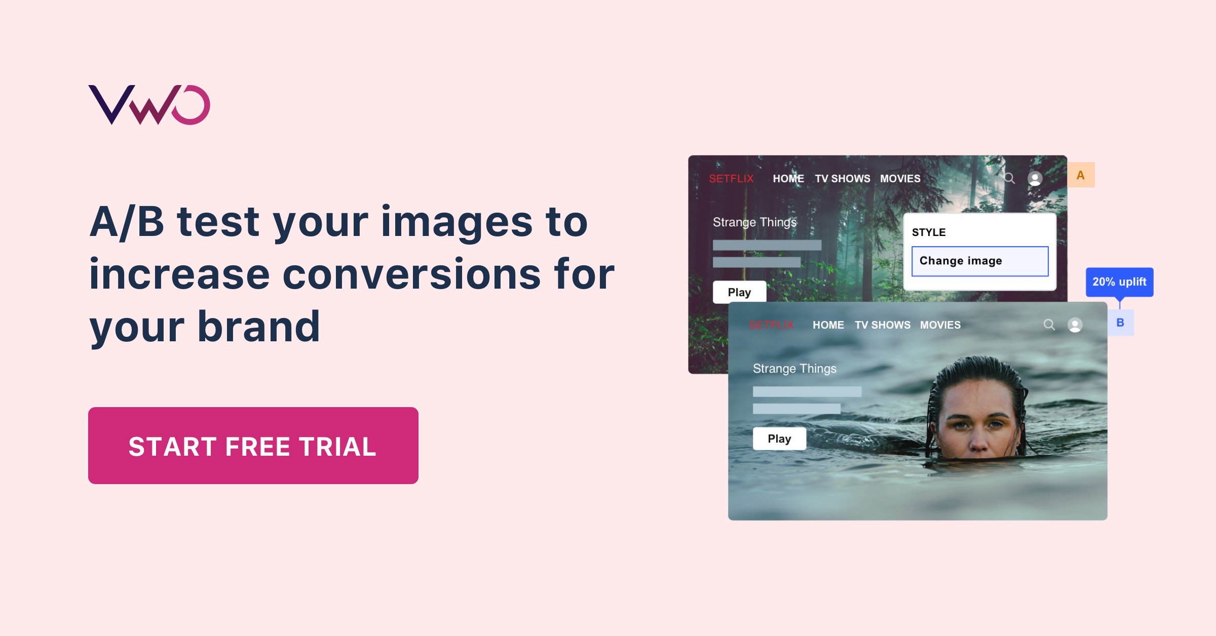
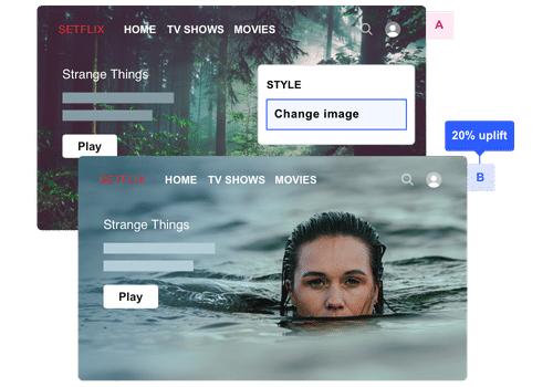
No matter which one of these image slider alternatives you try, don’t forget to A/B test it. Even if you are 100% confident that your treatment page will increase conversions, test it just to see how much percentage improvement it means over your Control page.