Posted in A/B Split Testing, Case Studies on February 14th, 2013
Today’s study is very useful for eCommerce companies. It shows why using larger product images on your category or product pages might be better than providing product information.
Conversion rate optimization agency Optimics used Visual Website Optimizer to run an A/B test on the site
of their client MALL.CZ. The company is the Czech Republic’s second largest ecommerce retailer that sells a large variety of products which includes Small Household Appliances, Electronics, Computer and Peripherals, Mobile Phones, Toys and lots more. Among many other tests, Optimics wanted to see if larger product images had any impact on sales and revenue. The primary goal was to increase sales.
The Test
Optimics created two variations; the first had slightly larger product images and the second had larger images with description show up on mouseover.
Control – Original size of product images along with text description

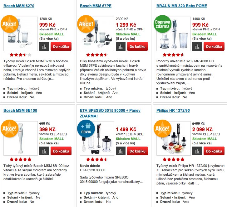
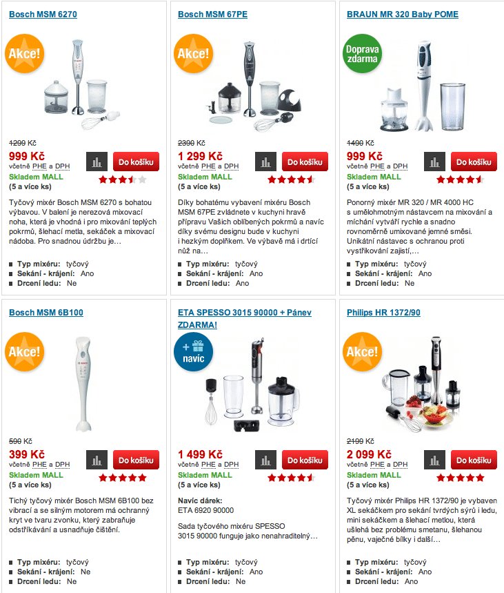
Variation 1 – Large product images with text

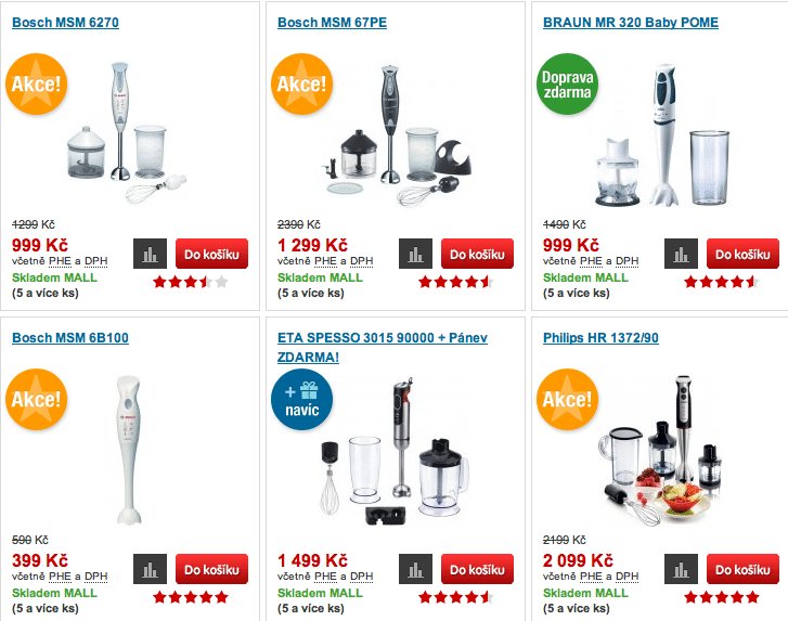
Variation 2 – Large product images with text description viewable on mouse over

The Result
Variation 2 with the large images and product description viewable on mouse over was the winner. It resulted in a straight 9.46% increase in sales (96% chance to beat original) with exactly zero Czech korunas spent on advertising.
Marek Cais from Optimics told us that larger product images seemed to work better regardless of product type. While “an image speaks a thousand words” is a well-known adage, it obviously works for ecommerce too. Drawing comparisons with shopper behavior in brick-and-mortar stores, you’ll see that customers walk in, look at a variety of products then settle on one or two and spend some time looking at them closely. If the product is something like a pair of shoes, they’ll even try them on and then walk in front of the mirror.
In all cases, they’re looking at the product as they make the journey from interest, desire and finally action. Nicely shot product images essentially mimic this pattern, allowing website viewers to have a good look at the object of their interest before buying.
Other useful articles on product images
- How to take gorgeous product photos – Practical Ecommerce
- Improve Your E-Commerce Design With Brilliant Product Photos – Smashing Magazine
- Product Images Best Practices: Part 1, Part 2 and Part 3 – Complete Usability
- 5 Tips for Improving Product Photos & Video on Your Ecommerce Site – Mashable
Update: There was an error where Control and Variation 2 had been interchanged. It has now been corrected.
Siddharth Deswal
Marketing Associate at Wingify. Have been involved with web development for about 8 years now and actively look to help online businesses discover the value of Conversion Rate Optimization.
Tags
I ♥ Split Testing Blog
Stay up to date
Latest Posts
Latest Tweets
- 5 Third-Party Tools for Reducing Shopping Cart Abandonment via @groovecommerce http://t.co/hOMDVssMvV #
- RT @unbounce: A/B Testing Between Free and Paid Signups: Sometimes Free is Better: http://t.co/MtiATLWOeQ by @wingify #
- Interesting results from our new case study - "A/B Testing Between Free and Paid Signups: Sometimes Free is Better" http://t.co/gmd9jyBFwA #
- @JuliaFok Our $129/mo package that gives 30,000 visitors to test seems like a good fit for you. #
- New post on our blog: Extend Your Conversion Funnel Beyond the "Thank-You" Page http://t.co/rEEtlVrxv9 #
Write for this blog!
We accept high quality articles related to A/B testing and online marketing. Send your proposals to contribute@wingify.com

10 Comments
February 14, 2013
Nice test! Thanks :)
Finally I suppose the winner variation was 1, not 2 :)
In your text: “Variation 2 with the large images and minimal text was the winner.”
Thanks again, good to know, larger product images forever.
Gerard
February 14, 2013
Thanks for pointing that out Gerald :) Have made the correction.
February 15, 2013
Hi,
Great test! Just wondering how you can set up the test site wide? I assume you don’t have to change every single product slot.
Cheer, Daniel
February 15, 2013
Hi Daniel,
In the Test Page Pattern, enter an * (asterisk) after your website URL.
So if your URL is http://example.com then to run it on the entire site you’d use http://example.com*
Hope this helps. Catch us on Support@wingify.com if you need further assistance.
February 15, 2013
Hi Daniel,
it requires a little bit of manual jQuery coding, you cannot achieve that using the WYSIWYG editor. But if you switch to the code editor in VWO, you can do some magic :)
In this particular test, we had to change the “SRC” attribute of all the product images, so that it pointed to higher resolution photos.
February 16, 2013
Daniel, if you want more detailed instructions, we’ve posted an article dedicated to that topic here: landersoptimized.com/guides/lean-conversion-optimization-strategies-for-fast-implementation-and-results/
@Siddharth: We’ve also ran a test on increasing category images that increased revenue-per-visitor by 22% – I think that it has more of an effect on products that have more detail to them – for example, I don’t think it would be very effective on t-shirts, but would be very effective on electronics. You can check it out here http://landersoptimized.com/case-studies/3-consecutive-wins-for-tinytotties-com/
February 18, 2013
@Cooper,
That’s a very interesting case study and I think you’re right, detail oriented products will benefit far more from larger images.
This calls for an A/B test in itself.
February 18, 2013
Hmm, and what about the customers on tablets? They won’t be able to see the descriptions…
February 18, 2013
“A little bit of coding” can mean thousands (in CZK) spent on coding, testing, evaluation, PM etc. .. so yes, money spent on ads was zero, but that was not the price of making it better ..
Secondary, this “beautification” was possible only because all of pictures are isolated on white background. Gradients, grey image bgr or other colors could drive it completely different way and I am not sure, if even MALL is capable of pushing all sellers into providing “white bgr only” images ..
February 22, 2013
That’s totally true. Larger product images will leave good impression on the visitor’s mind and they will increase your business sales online. I have designed many e-commerce websites and already used this concept for my clients. They are happy with their business sales.
Sorry, the comment form is closed at this time. To start a discussion, please email info@wingify.com.
RSS feed for comments on this post.