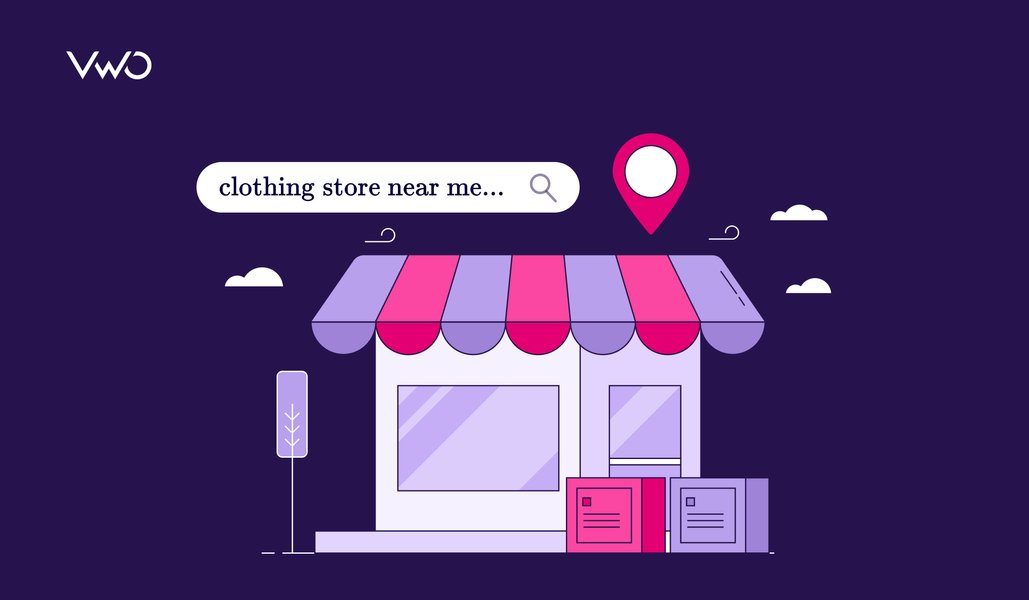
“Last year, we saw a remarkable shift where 30% of our online orders found their…
Ketan Pande
12 Min Read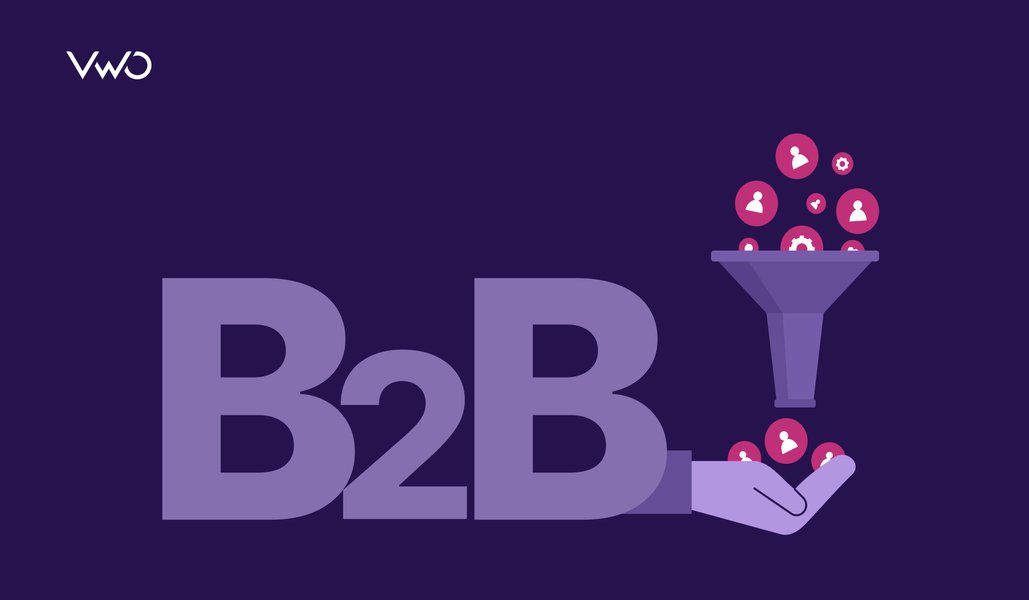
A massive 7258% surge in the number of marketing tech companies in just 12 years.…
Ketan Pande
14 Min Read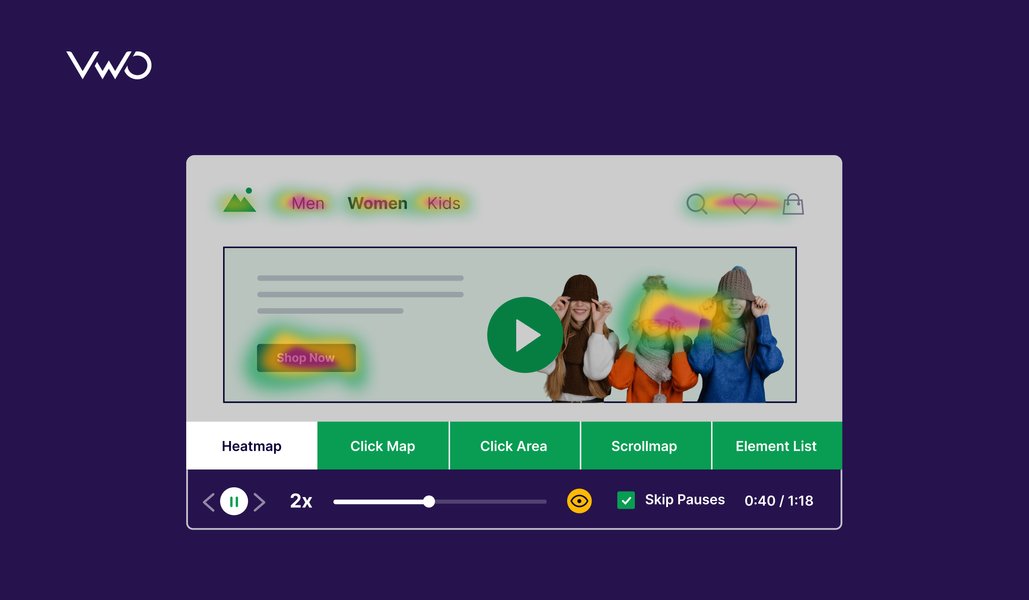
Website analytics is like a collection of numbers that can tell stories of success or…
Ketan Pande
6 Min Read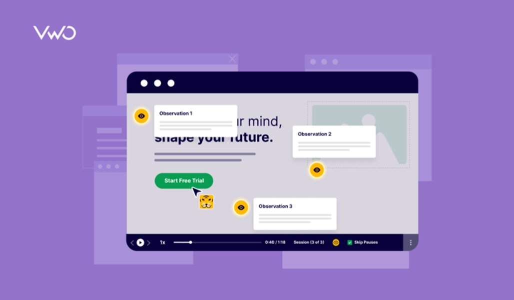
Do you know what makes successful companies what they are? No, they don’t wave a…
Pratyusha Guha
13 Min Read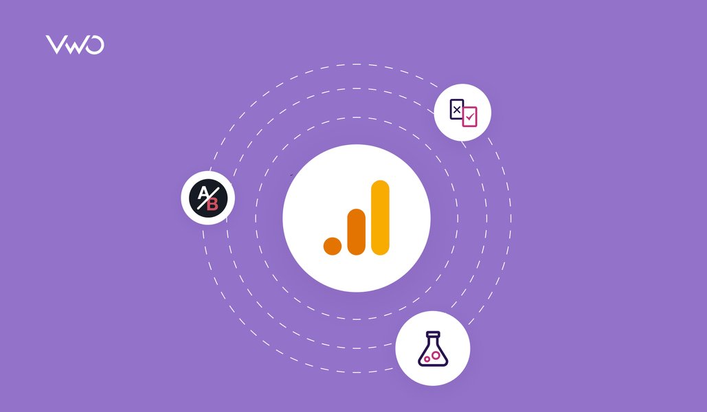
11 July 2023, and 30 October 2023. These two days had everyone in the business…
Pratyusha Guha
7 Min Read
Imagine a world devoid of customer behavior analysis tools. There would be no dearth of…
Niti Sharma
9 Min Read
Corey, a sneaker enthusiast, had one of the most disappointing website experiences. In the pursuit…
Ketan Pande
14 Min Read
‘Supposing is good, but finding out is better.’ – Mark Twain In the realm of…
Pratyusha Guha
15+ Min Read
“105% uplift in click-through rate!” It’s not uncommon to anticipate growth in A/B testing. But…
Ketan Pande
13 Min Read
Join our community of 10,000+ Marketing, Product & UX Folks today & never miss the latest from the world of experience optimization.
Talk to a sales representative
Free for 30 days. No credit card required
Awesome! Your meeting is confirmed for at
Thank you, for sharing your details.
I can't wait to meet you on at

, thank you for sharing the details. Your dedicated VWO representative, will be in touch shortly to set up a time for this demo.
We're satisfied and glad we picked VWO. We're getting the ROI from our experiments.
Christoffer Kjellberg CRO Manager
VWO has been so helpful in our optimization efforts. Testing opportunities are endless and it has allowed us to easily identify, set up, and run multiple tests at a time.
Elizabeth Levitan Digital Optimization Specialist
As the project manager for our experimentation process, I love how the functionality of VWO allows us to get up and going quickly but also gives us the flexibility to be more complex with our testing.
Tara Rowe Marketing Technology Manager
You don't need a website development background to make VWO work for you. The VWO support team is amazing
Elizabeth Romanski Consumer Marketing & Analytics Manager


Awesome! Your meeting is confirmed for at
Thank you, for sharing your details.


