MoneYou Removed Distractions To Increase Its Saving Account Sign-Ups
About MoneYou
MoneYou is an online service provider that specializes in savings, insurance, loans, investment, and mortgage products. A 100% subsidiary of ABN AMRO Bank, MoneYou focuses on simplifying financial products for its clients.
Being an online service provider, MoneYou understood the need to constantly find ways to improve conversions through its website. They selected VWO for its capabilities, ease of use, and richness of insights provided.
Goals: Increasing Conversions by Identifying and Eliminating Webpage Elements That Distract Visitors
MoneYou used VWO tools like heatmaps and clickmaps for its Savings product landing page.
On studying the results, the online team analyzed that by removing extra, less-value-adding elements from the page, they could increase engagement, click-through rates (CTRs), and final conversion ratio in terms of the number of people signing up for accounts.
Tests run: A/B Test Helped Validate That Removing Distractions Would Boost CTRs, Engagement, and Conversions
The key to the solution lay in identifying those elements on the Savings landing page that distracted visitors and ended up in bounces rather than conversions. The idea was to make sure that the page had enough relevant information to move visitors to the next stage of the funnel, leading to opening of more accounts.
The control for the test was the original landing page, which looked like this.
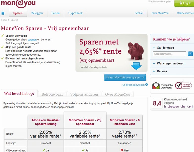
The team identified 2 elements as distractions on the original landing page. One was that the letter O in the Dutch word opneembaar was in lower case. The second was the presence of information tabs that the team felt did not serve any purpose.
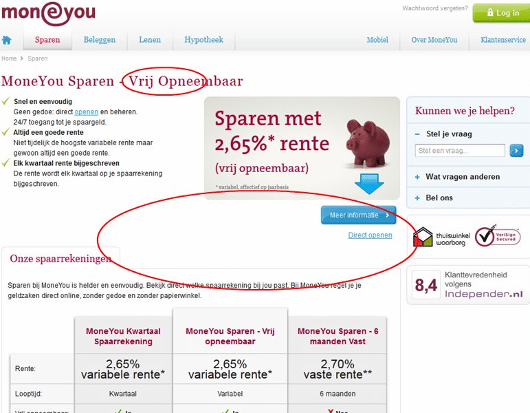
A variation, as shown below, was developed. The “O” in “opneembaar” was capitalized, and the extra tabs were removed.
Variation – Extra tabs removed and clutter trimmed
Conclusion: CTRs, Engagement, and Conversion Increased with More than 95% Confidence
Tracking of CTRs from the “More Information” CTA button (Meer informatie), engagement, and final conversion rate of visitors opening accounts showed amazing results with the variation.
- CTR increased by 7.65% (from 31.62% to 34.04%) with 99% significance.
- Engagement increased by 4.98% (from 38.49% to 40.41%) with 96% significance.
- Conversion rate for visitors signing up for saving accounts increased by 14.86% (from 9.69% to 11.13%) with 95+% significance.
The most important takeaway from this test was this: Clear the path for visitors looking to buy, and provide them just the required amount of information.
Here’s a TED talk on how information overload affects decision making.

Location
Amsterdam, Netherlands
Industry
Finance
Impact
14.86% increase in Sign-ups