UKToolCentre Improved User Experience To Increase Site Engagement
About UKToolCentre
Operating from a showroom for more than 60 years, UK Tool Centre has now brought its range online for delivery throughout the UK. This company offers a huge range of over 10,000 products.
Back in February 2012, we had published a success story on how adding a product filter to an eCommerce website affected revenues. Buyakilt.com A/B tested the inclusion of a filter on their product pages, allowing visitors to “slice and dice” through all the options available and quickly arrive at what they wanted to buy, helping the website increase revenues by a whopping 76%.
Here’s a case from UK Tool Centre for you which shows how benefits can be accrued by removing a product filter.
Goals
Although filters are found all over the web and are almost de rigueur for eCommerce websites, the folks at UK Tool Centre theorized that for this specific category (a brand of woodcare products called Cuprinol), the filter menu was unnecessarily adding extra options to the page which wasn’t required.
Tests run
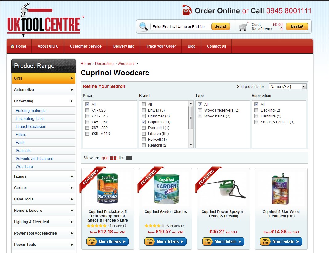
Here is the page on which the UK Tool Centre team conducted the test. This page had a filter menu for all products just above the Cuprinol listing.
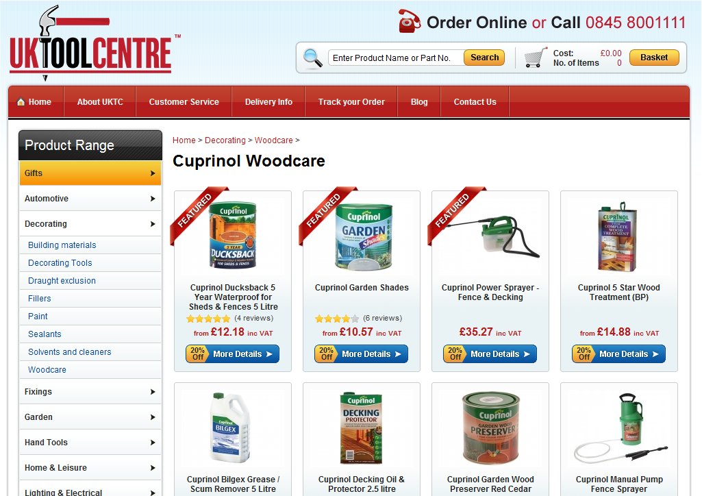
In the variation, the filter menu was removed from the category, the hypothesis being that when focused on a particular product, a user did not need the menu to distract him/her away from it.
Conclusion
A surprising increase of 27% in engagement on the product page. What happened was that visitors were less distracted by the filter and the easy option of leaving the page that it provided. This increased site engagement meaning they clicked around more and had a better look at all the products on the page.
Learning Points
Don’t distract your visitors with unnecessary options and try to provide them exactly what they want. When they are looking for something, give them the tools to make that search a breezy affair. After they have found it, let them stay and look around undisturbed by other options.
Also, we cannot stress enough the importance of regular testing. Buyakilt.com experienced an increase in conversion rate when they added a product filter, but UK Tool Centre saw the increase after removing the filter. This just goes to show that there are no hard and fast rules and you should run tests to see what works best on your site.

Location
Abberley, England (UK)
Industry
Retail
Experiment goals
Increase engagement, increase clicks on products
Impact
27% increase in Engagement