Markitekt And Designboost Tested Home Page Length to Increase CTR
About Designboost
Long landing pages versus short landing pages is a debate that is as old as the Internet itself. The moment someone decides to sell his wares online, the dilemma arises: given the less attention span, should he be giving specific information about the product and getting to the point quicker or should he try to make a convincing case first and then persuade the visitor to make a purchase? Actually, it’s a central problem of persuasion and marketers battle with the question of ‘how much information is enough‘ every single day in their jobs.
What if you are not selling, but actually giving out something for free? Free as in free beer. Do you still need long landing pages to convince people to take up a free offer? I realize that on the Internet, even freebies have to be sold but the question is how hard should you try?
That’s what one of Designboost intended to find out. They hired Markitekt to design and run an A/B test by using VWO.
Goals
Designboost.net is a brand new website, so this is just the beginning of a long conversion optimization process that intend to partake. For the home page, they needed to figure out what works best for the audience. MarketIt tells us that in their past tests, they have consistently seen short home pages outperform long home pages if the offer is free (that is, email sign-up). So, they wanted to see if a shorter home page will outperform longer one here as well.
Tests run
It is worthwhile to note here that even though Designboost’s experience suggested that a short home page would work better, they didn’t go ahead and implement it directly. Instead, they did the right thing and A/B tested their hypothesis.
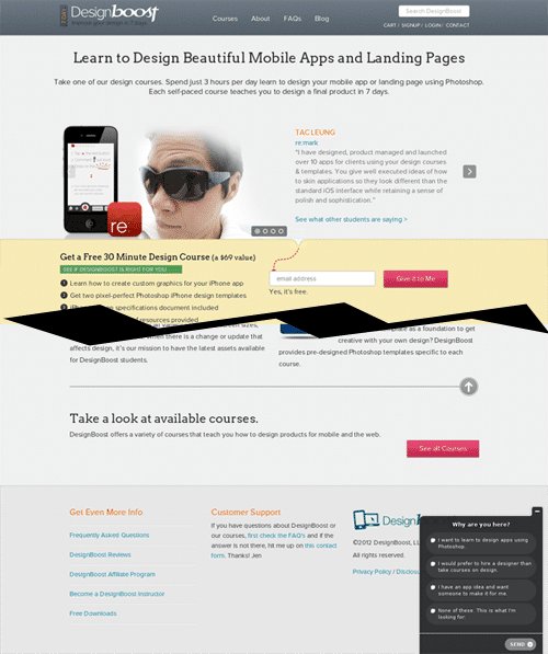
This is how the long version of the home page appeared:
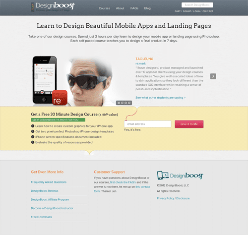
This is how the trimmed shorter version of the home page appeared:
Conclusion
The shorter home page got 13% more email sign-ups and 25% more click-throughs to the courses page. Their comment on the test results: “If the goal of a page is to get email sign-ups or to get people off the home page, shorter pages can work better.”
Needless to say, Designboost are happy with the results and as they said, this is just the first step in their journey toward a full conversion rate optimization nirvana on their website!
How has your experience been for short landing pages or long landing pages? Which ones work best for you?

Location
Atlanta, Georgia (US)
Industry
eLearning
Impact
25% increase in Click-through rate