How MedaliaArt Reduced Their Website’s Bounce Rate By Using A/B Testing
About MedaliaArt
MedaliaArt is an online art gallery specializing in Caribbean and Latin American art. Their sales process is long (involving phone calls, multiple visits, and others), so they chose to measure and optimize the bounce rate instead of sales conversions.
For the holiday season, they had put up a sale where they gave 5–55% discounts on all paintings.
Goals
Hypothesis
Providing discounts must pull in more visitors to go through multiple pages on the website, exploring different paintings.
However, the challenge with putting up a Holiday Sale message is where to show it. Displaying it prominently on the home page would make more visitors notice it, but some may find it too intrusive and leave the site immediately. On the other hand, putting it at a not-so-noticeable location may have no effect at all. So, what could be the best position on page to display the Holiday Sale (or for that matter any other promotional) message?
They wanted to determine the best location on the homepage to put up that message, to optimize for reduced bounce rate.
Tests run
Only a split URL test could answer that.
MedaliaArt set up a split test to optimize their website for bounce rate. First, they created a couple of versions of the home page with Holiday Sale displayed at different locations. Of all versions, the following represented the 2 extremes:
The first displayed in big, red font prominently on the home page.
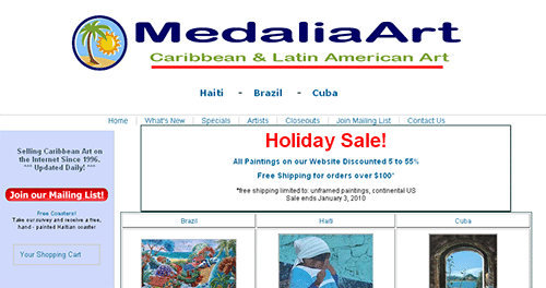
Variation 1
The other, or Variation 2, sidebar Holiday Sale message in small font looked as follows:
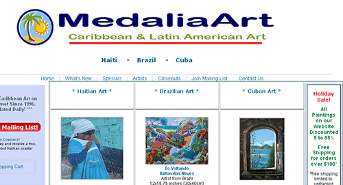
Variation 2
Conclusion
Usually, split testing tools do not track bounce rate; they rather track the conversion rate (percentage of visitors doing desired action). To track the bounce rate instead, MedaliaArt did a neat trick. They defined a click on any link on the home page as conversion. Thus, the conversion rate of, for example, 40% corresponded to
100 – 40 = 60% bounce rate.
So, which variation had a better bounce rate? Any guesses?
They started the test and after 2 weeks, got their first batch of conclusive results.
| Message location | Visitors | Clicks (conversions) | Conversion Rate | Bounce Rate | Reduction |
| Sidebar | 145 | 35 | 24% | 76% | N.A. |
| In-your-face | 123 | 49 | 40% | 60% | -21% |
The in-your-face, prominent promotional message had dramatically less bounce rate (60%) than the sidebar one (76%). The reduction in bounce rate of 21% is statistically significant (at 95% confidence level), so the in-your-face variation represents a better version. The improvement in the bounce rate means more interest by visitors in the paintings they are selling and potentially more sales. Request a demo to have a better understanding about the product.
Takeaways for MedaliaArt/eCommerce stores optimizing for promotional messages:
- Have a variation with no Holiday Sale messaging: If they had a variation with no ‘Holiday Sale’ messaging, it would have provided a benchmark to see the effect of the sales message, irrespective of the position.
- Test message text also: Instead of testing the message location, it will be wise to see the effect of text in the message as well. Maybe a message with the word discount (such as 55% discount on paintings this holiday season) will work better than the default one (Holiday Sale).
- Optimize for sales or purchases: While optimizing for the bounce rate is fine, a better metric would be to measure and optimize for sales, which is what really matters for an eCommerce site.
What eCommerce stores can benefit from this success story?
Split testing is the only way to really know what will work and what won’t. Testing is essential to check assumptions related to promotional messages, checkout process, product category ordering, buy now button, and others. Be a little adventurous and test radically different home page designs and ideas. You can always choose to include only a small percentage of traffic and can disable non-performing variations at the click of a button.
So, what’s your excuse for not using split testing for increasing sales for your eCommerce store? Start your free trial today to know how.

Location
East Setauket, NY (US)
Industry
Retail
Impact
21% decrease in Bounce rate