What Device Magic Learned From A Video Vs. Image Slider A/B Test
About Device Magic
Video always has interesting effects on conversion rate or sales on a website. In a lot of cases, video helps in explaining the service or the product, and hence increases sales. In other cases, it may actually reduce conversions (probably because it is not a good fit for that website, or that video is poorly made or presented).
Device Magic Mobile Forms allows organizations to quickly and easily build robust data collection systems. Using their API, developers can build rich integrations featuring push technologies such as for work orders, proof of delivery, maintenance reports, retail surveys, and others.
Goals
They wanted to see if a video or series of rotating jQuery slides would work best for driving people to sign up, so they conducted a simple A/B test by using VWO.
Tests run
The Device Magic team tested the existing version of their home page (which had a video) against a new version, which had a jQuery-based image slider instead.
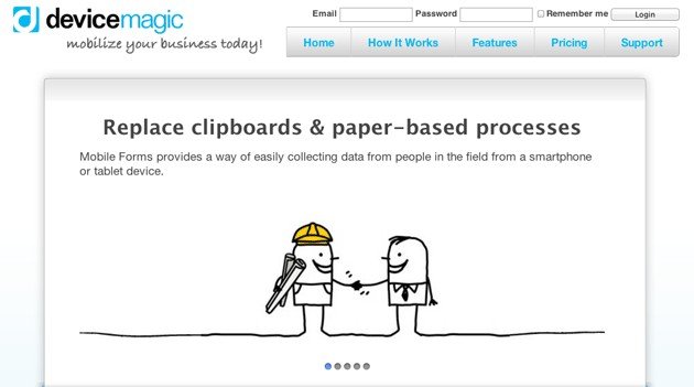
Here’s the image of the current home page, that is, with a video:

They weren’t sure that the video was of sufficient quality and suspected that it was too technical. This was the reason they felt that slides might present their offering more concisely.
Can you guess which version worked better?
Conclusion
They measured 2 goals:
- % conversion from home page to the sign-up page
- Number of sign-ups completed
Initially, their control (with the video) was beating the variation (with the image slider) and they couldn’t understand why. But then they let the test run for a while until they had a lot more data.
To their surprise, the result inverted to the variation outperforming the control, which is what they had expected. And this result was statistically significant.
The image slider variation increased conversions from the home page to the sign-up page by 35%, and the total increase in subsequent sign-ups was 31%. So, for Device Magic, the image slider worked better compared to the video.
A key learning from this test would be to get enough data so that you are absolutely sure of the result. Also, you shouldn’t be too hasty because some detail may be skewing the result or leading you in the wrong direction.
Patience in A/B testing is the key learning here. (We have an A/B test duration calculator online to tell you how long you should run a test before giving up on it).
If you have had a similar (or contrasting) experience testing video versus image sliders, do let us know in the comments below.

Location
Raleigh, North Carolina (US)
Industry
Software
Impact
31% increase in Sign-ups